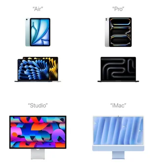
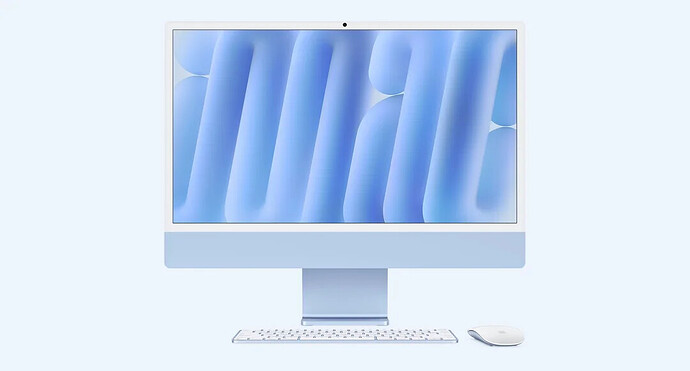
They have done this for the latest iPads Air and Pro, MacBooks Air and Pro, Studio Display, and probably others I lost track of. I bet we will see the same for other announcements this week too.

@Jensen
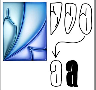
Still trying to figure out what that a on the iPad means
Cody said:
@Jensen
Still trying to figure out what that a on the iPad means
Same here. More inspiration is needed
Cody said:
@Jensen
Still trying to figure out what that a on the iPad means
Same here. More inspiration is needed
There’s never enough!
Cody said:
@Jensen
Still trying to figure out what that a on the iPad means
Same here. More inspiration is needed
If that pushes me to drop this Friday, count me in. I will update you
@Ari
Let me know if you can spot the hidden A in the picture.
Cody said:
@Jensen
Still trying to figure out what that a on the iPad means
Same here. More inspiration is needed
I am on it right now and still can’t find it lol
@Dakota
That did help. Where can I grab such good stuff?
Cody said:
@Jensen
Still trying to figure out what that a on the iPad means
[deleted]
Can you also explain the i and r to me?
Val said:
Cody said:
@Jensen
Still trying to figure out what that a on the iPad means
[deleted]
Can you also explain the i and r to me?
[deleted]
@Val
We are talking about the iPad Air wallpaper.
@Jensen
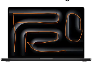
I don’t spot the Pro on the MBP
Jensen said:
@Jensen
I don’t spot the Pro on the MBP

@Jensen
Ahh got it now, thanks! I was looking for those parts as negative space. The O cutting off at the screen’s edge and looking more like an L really threw me off too
Jensen said:
@Jensen
Ahh got it now, thanks! I was looking for those parts as negative space. The O cutting off at the screen’s edge and looking more like an L really threw me off too
Yeah, the O is tricky. Took me a while to see it too, but once I did, it felt like an intentional choice. I like that they seem to favor a typographic abstract style instead of just clear text. You can see it better in the animation at the top of the MBP product page.
Jensen said:
@Jensen
I don’t spot the Pro on the MBP
It’s on the screen
@Jensen
The iPad mini’s wallpaper has said mini for a while.

