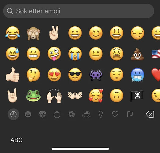
Has anyone else noticed this change
Maybe Tim Apple can’t see well anymore
UI elements have been getting bigger for a while. I noticed that the lockscreen widgets on my 16 Pro show less text than my smaller iPhones. Calendar events get cut off on the 16 Pro, but my 13 mini shows everything.
With the new size, I can see 28 emojis. They look more recognizable now. I think I like it better.
I’ve disliked it since the betas. An option to change the size would be nice, but more emojis means more scrolling. It’s not what I wanted.
River said:
I’ve disliked it since the betas. An option to change the size would be nice, but more emojis means more scrolling. It’s not what I wanted.
They should create a group for customizing your favorite 50 emojis. That way, they wouldn’t change unless you want them to.
@Page
Totally agree. That would be so helpful
River said:
I’ve disliked it since the betas. An option to change the size would be nice, but more emojis means more scrolling. It’s not what I wanted.
We need to condense the different groups of emojis. Like how they do for letter variations.
For instance, long pressing ![]() could show a popup with options like
could show a popup with options like
![]()
![]()
![]()
![]() . I know it complicates dragging emojis as stickers, but surely they can work something out.
. I know it complicates dragging emojis as stickers, but surely they can work something out.
@Chen
I’d love this for the different people emojis too. I appreciate the gender-neutral options, but I never use them, so it would be great to reduce that collection.
River said:
@Chen
I’d love this for the different people emojis too. I appreciate the gender-neutral options, but I never use them, so it would be great to reduce that collection.
Maybe allow us to disable the ones we don’t want
Is it so we can actually see the emojis better now
Farrell said:
Is it so we can actually see the emojis better now
I could already see them. Now I see fewer at a time.
Farrell said:
Is it so we can actually see the emojis better now
I could already see them. Now I see fewer at a time.
Exactly. More scrolling now
River said:
Farrell said:
Is it so we can actually see the emojis better now
I could already see them. Now I see fewer at a time.
Exactly. More scrolling now
Can’t you just search for the emoji you need
River said:
Farrell said:
Is it so we can actually see the emojis better now
I could already see them. Now I see fewer at a time.
Exactly. More scrolling now
![]()
Farrell said:
Is it so we can actually see the emojis better now
Maybe it’s time for an eye check if the old emojis were hard to see
Farrell said:
Is it so we can actually see the emojis better now
Maybe it’s time for an eye check if the old emojis were hard to see
People are downvoting for no reason
If we can have this, why can’t we have a more complete keyboard
I actually like the new size. I sometimes miss the emoji I’m looking for, so this helps. Scrolling more isn’t a big deal
I like it. Now I can see the emojis clearly.
I love it, finally a good size
