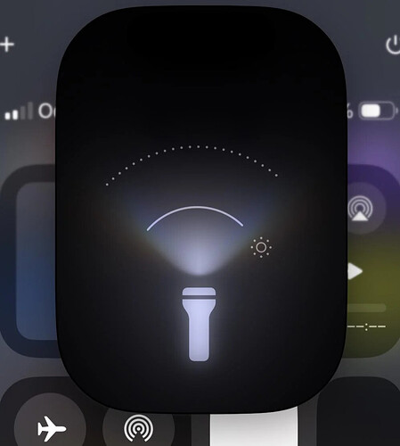
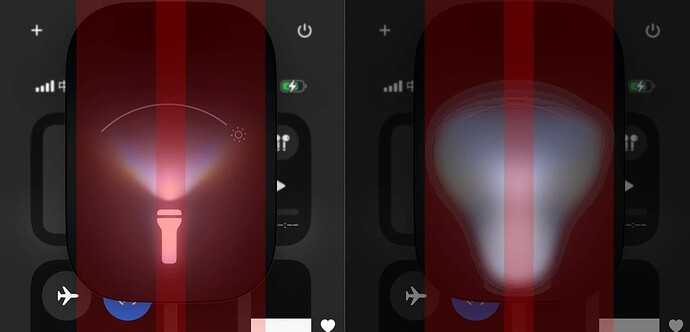
The curved line, dots, and the light itself are not centered or are angled slightly to the left.
Thanks now I can’t unsee it ![]()
Skyler said:
Thanks now I can’t unsee it
It’s the Heisenberg principle man
Skyler said:
Thanks now I can’t unsee it
LOL! ![]()
I’ve noticed this in iOS 18. They will probably fix these visual issues in the next update.
Sage said:
I’ve noticed this in iOS 18. They will probably fix these visual issues in the next update.
This looks unprofessional. Any decent company would have a designer making perfect mockups. I’ve worked at several software firms, and they’d catch even minor mistakes in colors or borders.
Sage said:
I’ve noticed this in iOS 18. They will probably fix these visual issues in the next update.
This looks unprofessional. Any decent company would have a designer making perfect mockups. I’ve worked at several software firms, and they’d catch even minor mistakes in colors or borders.
Ironically, Apple is all about design. I’m surprised these problems made it to launch.
ByteBoss said:
Sage said:
I’ve noticed this in iOS 18. They will probably fix these visual issues in the next update.
This looks unprofessional. Any decent company would have a designer making perfect mockups. I’ve worked at several software firms, and they’d catch even minor mistakes in colors or borders.
Ironically, Apple is all about design. I’m surprised these problems made it to launch.
You’re right. I remember hearing about Steve Jobs calling Google to point out a small color issue in their logo.
Sage said:
I’ve noticed this in iOS 18. They will probably fix these visual issues in the next update.
This looks unprofessional. Any decent company would have a designer making perfect mockups. I’ve worked at several software firms, and they’d catch even minor mistakes in colors or borders.
It’s not perfectly centered mathematically, but it looks centered visually. There’s an extra sun icon on the right, which shifts the visual center to the left. To check this, designers apply a blur to find the visual center, not just the mathematical one.
ByteBoss said:
Sage said:
I’ve noticed this in iOS 18. They will probably fix these visual issues in the next update.
This looks unprofessional. Any decent company would have a designer making perfect mockups. I’ve worked at several software firms, and they’d catch even minor mistakes in colors or borders.
It’s not perfectly centered mathematically, but it looks centered visually. There’s an extra sun icon on the right, which shifts the visual center to the left. To check this, designers apply a blur to find the visual center, not just the mathematical one.
What you said is mostly right, but this isn’t visually centered.
Kellan said:
ByteBoss said:
Sage said:
I’ve noticed this in iOS 18. They will probably fix these visual issues in the next update.
This looks unprofessional. Any decent company would have a designer making perfect mockups. I’ve worked at several software firms, and they’d catch even minor mistakes in colors or borders.
It’s not perfectly centered mathematically, but it looks centered visually. There’s an extra sun icon on the right, which shifts the visual center to the left. To check this, designers apply a blur to find the visual center, not just the mathematical one.
What you said is mostly right, but this isn’t visually centered.
It might be centered by mass, but the curves make your eyes focus on those points more.
ByteBoss said:
Sage said:
I’ve noticed this in iOS 18. They will probably fix these visual issues in the next update.
This looks unprofessional. Any decent company would have a designer making perfect mockups. I’ve worked at several software firms, and they’d catch even minor mistakes in colors or borders.
It’s not perfectly centered mathematically, but it looks centered visually. There’s an extra sun icon on the right, which shifts the visual center to the left. To check this, designers apply a blur to find the visual center, not just the mathematical one.
This isn’t visually centered. There are a few ways to center shapes. You can center the entire shape, find the center of mass, or center the main figure. In this case, the center of mass would apply. If the sun icon were further right, the visual center would still be the flashlight.
ByteBoss said:
Sage said:
I’ve noticed this in iOS 18. They will probably fix these visual issues in the next update.
This looks unprofessional. Any decent company would have a designer making perfect mockups. I’ve worked at several software firms, and they’d catch even minor mistakes in colors or borders.
It’s not perfectly centered mathematically, but it looks centered visually. There’s an extra sun icon on the right, which shifts the visual center to the left. To check this, designers apply a blur to find the visual center, not just the mathematical one.
If you’re going to complain, at least know what you’re talking about.
Sage said:
I’ve noticed this in iOS 18. They will probably fix these visual issues in the next update.
This looks unprofessional. Any decent company would have a designer making perfect mockups. I’ve worked at several software firms, and they’d catch even minor mistakes in colors or borders.
While it should be perfect, the flaws add a human touch. It’s annoying but kind of endearing. Someone will probably lose their job over this.
Sage said:
I’ve noticed this in iOS 18. They will probably fix these visual issues in the next update.
This looks unprofessional. Any decent company would have a designer making perfect mockups. I’ve worked at several software firms, and they’d catch even minor mistakes in colors or borders.
As a software dev, this is the least of our concerns. We’d fix it eventually, but it’s not a priority.
Sage said:
I’ve noticed this in iOS 18. They will probably fix these visual issues in the next update.
This looks unprofessional. Any decent company would have a designer making perfect mockups. I’ve worked at several software firms, and they’d catch even minor mistakes in colors or borders.
This issue seems more related to the developer and QA process than the designers.
Sage said:
I’ve noticed this in iOS 18. They will probably fix these visual issues in the next update.
Imagine explaining ‘visual nuances’ to my bosses.
I’m guessing it’s aligned for brightness. They probably moved everything slightly left to avoid looking ‘off’.


